A few days ago SmallBizPod was invited to try out a new collaboration took for designers and their clients. It’s web-based: all you need is a browser. Clients don’t have to register in order to participate. You just nominate them when you create the project. It’s free, it takes no time to learn and it is incredibly simple.
In fact, it’s probably too simple. But this is all part of the plan. The people behind the project are keenly aware that what you cook up in the lab’ can be quite different to what real users want. So they spent about four months building a robust ‘beta’ version and then offered it to allcomers to give feedback. The theory is that they will then respond quickly to the best ideas and the project evolves into something that fits the users’ needs.
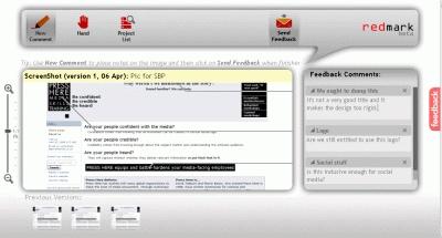
This particular project is called redmark, which is a bit of a misnomer because it implies coloured markup of design and it does neither. It simply allows you to click on a spot on a design then comment on it – the comments are arranged down the right hand side and connected to the hotspots with black lines. Here’s a reduced size screen shot:

redmark screen shot
On the left is an image size slider, one of the icons at the top is a hand tool for moving it around and underneath are icons linking to previous designs and their comments.
The designer is emailed whenever comments are made and the clients are emailed whenever the design changes. Two people (the current limit for clients per design) cannot comment at the same time. What’s a little bit frustrating is that the designer can’t comment either, unless they pretend they’re a client (which is what I did, but it’s a waste of an invite.) Two weeks ago, this was added to the ‘planned development list’. It will be a good indicator of how responsive the team is.
If you’re interested in participating in the beta trial, SmallBizPod has been given a code (M27005) which will let you in, providing you’re one of the first 50 to try it. Our beloved leader, Alex Bellinger nicked one. So did I.
To approach an online publication like this was an interesting move for the founders. Co-founder Anton Babadjanov came to us because we’d already written about another online design service called ConceptShare, which he describes as “a good tool, indeed”. But describes redmark as, “a free alternative to it, and we plan to keep it free.” Calling it an ‘alternative’ is cheeky but, as he says, it is free.
I asked him what his business model is. After all, no-one can live on air. He replied, “We believe that by helping the whole graphic community with a widely available and useful application we will be able to explore different monetization strategies.”
Like so many web 2.0 companies it seems to be a case of, ‘build the community first and then see what the options are’. If they want to keep it free, then I guess that leaves advertising or some other access to the user base as the source of revenue. From an exit perspective, ‘get bought’ has to be an option.
The people behind it are young (in their twenties) and enthusiastic. They also have also squeezed in a fair amount of practical and relevant intellectual grounding while pursuing their graduate and post-graduate courses. They have also recruited others to the team.
Babadjanov started a web design and application development consultancy in British Columbia a couple of years ago while redmark co-founder Deyan Vitanov is an MBA student at Stanford, where he’s been well and truly bitten by the start-up bug. Apart from anything else, he’s responsible for ‘investor relations’ within the Entrepreneurship Club. Smart move.
They have a structured approach to potentially major projects, which enables them to abandon them rapidly if they see trouble ahead. The stages are brainstorming, analysis then prototyping and release. They brainstorm around problems and potential matching technologies ‘that excite them’. They do a first pass filter by consulting as many trusted sources as possible in the hunt for any show stoppers. They aim to identify three projects then conduct further research to find the one with the highest potential. Then they start prototyping their favoured project. Which is where redflag comes in.
Quite whether they should have involved the media at this stage is a difficult one to answer. On the one hand, they collect beta testers and potentially life-saving feedback. On the other, they could simply turn people off if the product is not yet compelling enough or if they are not as responsive as they need to be to sustain the goodwill of their beta users.
As someone who got bitten by the startup bug many years ago while visiting Palo Alto and Menlo Park in Silicon Valley, I know what it’s like. It’s exciting (mine was called Caxton Software). It’s a unique part of the world where almost anything seems possible. Good luck to them. If this project fails, I doubt this will be the last we hear of these two enterprising Bulgarians.


Have You Read This?
Generative AI Checkpoint
From Barcode Scanning to Smart Data Capture
Beyond the Barcode: Smart Data Capture
The Evolving Role of Converged Infrastructure in Modern IT
Evaluating the Potential of Hyper-Converged Storage
Kubernetes as an enterprise multi-cloud enabler
A CX perspective on the Contact Centre
Automation of SAP Master Data Management